
On 11 April 2025, the EUIPO Opposition Division rejected an opposition brought by Patek Philippe against a figurative trade mark featuring two stylised letters ‘PP’. The Swiss luxury watchmaker alleged a likelihood of confusion with its own figurative ‘PP’ shield marks. However, the Office concluded that the visual differences between the signs were sufficient to exclude any risk of consumer confusion, even assuming the goods and services were identical.
Case Background
The opposition concerned an EU trade mark application filed by Maria Groen of the Netherlands. The mark consisted of two bold, pink, stylised ‘PP’ letters positioned diagonally and connected by a faint elliptical line. The application covered goods in Class 14, including jewellery, watches, and precious stones, and services in Class 35 such as retail and wholesale of fashion accessories and timepieces.
Patek Philippe relied on two earlier figurative marks
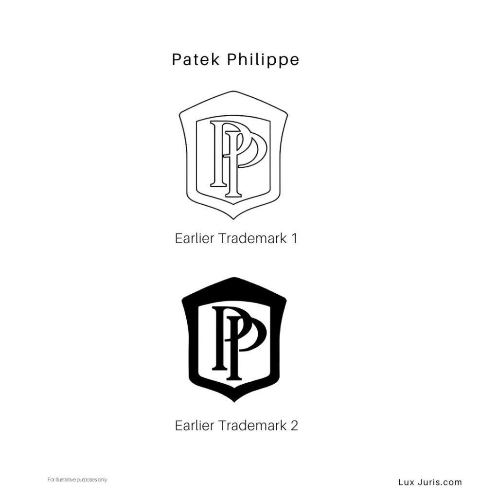
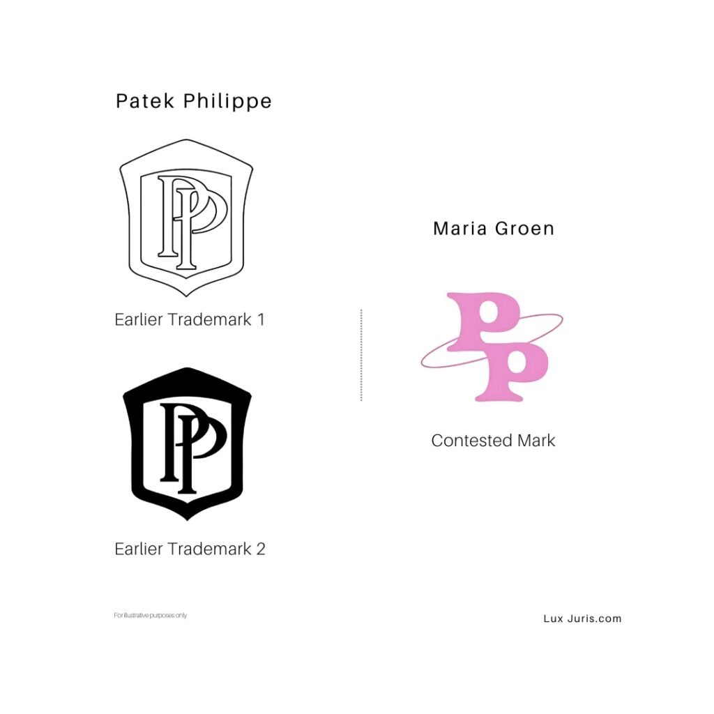
Earlier mark 1: A figurative trade mark protected through international registration, covering the European Union, Croatia, and Slovenia. It consists of two overlapping, thinly stylised capital letters ‘PP’ placed inside a decorative shield. The design is rendered in black and white and conveys a refined, monogram-style emblem.
Earlier mark 2: An EU trade mark registration that features the same visual composition as the first mark, two overlapping, stylised ‘P’ letters within a shield but with minor variations in presentation and colour.
Both earlier rights consisted of the same stylised ‘PP’ monogram enclosed within a shield design. The opposition was based on Article 8(1)(b) EUTMR, which applies where there is a likelihood of confusion on the part of the public due to the similarity of marks and goods or services.
Basis of the Opposition
Patek Philippe claimed the signs were aurally and visually similar, and that the relevant goods and services were either identical or closely related. It further submitted that its earlier marks enjoyed enhanced distinctiveness due to their long-standing use in the luxury watch market.
However, the evidence supporting this claim was submitted outside the applicable deadline and was not taken into account. The EUIPO therefore assessed the marks based solely on their inherent distinctiveness.
Comparison of the Signs
The Office proceeded on the assumption that the goods and services in question were identical, in order to assess the opposition under the most favourable conditions for the opponent.
Both signs consisted of the letters ‘PP’. However, the manner of presentation differed significantly. Patek Philippe’s marks used thin, elegant letterforms, vertically aligned and enclosed in a shield device. The contested mark featured bold pink lettering with no frame, linked by an elliptical line. The letters were positioned asymmetrically, with one placed slightly above and to the left of the other.
The Opposition Division observed that none of the signs had a dominant element. In the case of short marks, all components are likely to be perceived simultaneously, and minor differences in stylisation can affect the overall impression. The case law also supports the view that, for two-letter marks, visual differences are often decisive in the absence of any distinct conceptual content.
Conceptually, the earlier marks may evoke the idea of a heraldic shield, although this was found to have limited distinctiveness. The contested sign carried no apparent concept. As a result, the Office found no conceptual similarity between the marks.
Aurally, the signs were identical, both being read as ‘PP’. However, this alone was insufficient to establish a likelihood of confusion in view of the distinct visual impressions.
Distinctiveness and Overall Assessment
The earlier marks were considered to possess a normal level of distinctiveness, notwithstanding the presence of decorative or weak elements. The relevant public consisted of both general consumers and professionals. Given the nature of the goods and services, the degree of attention was deemed to range from average to high.
Despite these factors, the Opposition Division found that the visual dissimilarities between the signs were significant. The colour, positioning, weight and presentation of the letters contributed to an overall impression that was sufficiently different to prevent confusion. Even for identical goods and services, the shared use of the letters PP was not enough to outweigh these differences.
Reference to Previous Decisions
Patek Philippe cited earlier decisions from the EUIPO and the CJEU. However, the Office noted that most involved comparisons between word and figurative marks, or between marks with minimal stylisation, and were not directly relevant to the present case. It reaffirmed that each case must be assessed on its own facts, and the Office is not bound by its previous decisions.
Outcome
The opposition was rejected in full. As the applicant had not appointed a professional representative, no costs were awarded. Patek Philippe retains the right to appeal the decision.
Conclusion
This decision reflects a consistent approach by the EUIPO when assessing stylised marks composed of minimal letter combinations. The presence of shared initials, even in a specialised sector such as luxury watches, does not in itself support a finding of confusion where the overall visual presentation is sufficiently different. For brands relying on monogram-style identifiers, timely submission of evidence remains essential, and distinctiveness must be evaluated in the context of the complete commercial impression rather than in isolation.